
 By
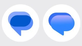
Google Messages is getting a fresh look. The latest beta introduces a completely redesigned app icon that swaps the familiar flat interlocking pills for a rounded speech bubble with a smooth blue gradient. The change arrived in Google Messages v20261030 beta and aligns the app with the gradient styling that Google has rolled out across its other apps.
The visual difference is immediately noticeable.
The old icon used two horizontal pills in different shades of blue. Where they overlapped, a third tone appeared. It looked clean and minimal, but it was also abstract. Nothing about the design screamed “messaging app” unless you already knew what it was. The new icon fixes that problem entirely. A plump, rounded speech bubble sits in the foreground, blending from a soft pinkish-blue at the top into vibrant royal blue at the bottom. Behind it, a smaller dark blue bubble peeks out at the upper left, suggesting an ongoing conversation.
The redesigned icon already works on Wear OS smartwatches through the same beta version. It has also reached the web version of Google Messages, where users may need to reinstall the web app for the updated icon to appear. This cross-platform rollout prevents the icon mismatch that sometimes happens when Google updates one version before the others.
However, the icon change is not the only update arriving in the Messages beta.
A redesigned pinned chats interface has started rolling out to beta users as well. The new layout features large contact photos displayed prominently at the top of the chat list. Several users on the r/GoogleMessages subreddit confirmed receiving the update, though availability remains limited. Even within the beta program, the pinned chats UI appears to be controlled by a server-side switch. Simply installing the new beta does not guarantee access.
Additionally, at least one beta user spotted a new floating action button for Search at the bottom of the Messages home screen. The button sits alongside the existing Start Chat pill and comes in both expanded and collapsed versions. Notably, the Gemini icon is absent from this new search button. According to earlier reports, Google plans to relocate the Gemini icon to the header, where it will replace the existing search icon.
These changes fit into a broader visual refresh that Google has been building throughout 2026. The M3 Expressive design language has gradually spread across Google’s apps, bringing brighter colors, playful animations, and more rounded elements. Google Messages has received several pieces of this overhaul already, including a reworked compose bar, repositioned icons, and updated contact pages.
Google has not confirmed when the new gradient icon or the pinned chats redesign will reach the stable version of Messages. For now, both remain limited to beta testers. Users who want to try the new look can join the Google Messages beta program through the Play Store.
https://www.techjuice.pk/google-messages-new-gradient-icon-pinned-chats-redesign/